Campsaround Branding
CAMPSAROUND PROFILE
Campsaround is the leading online booking platform for Camping , Glamping and alternative accommodations in Greece. Last year Campsaround grow up as a startup and becoming a fully factional booking platform with thousands of visitors per day.
My Role
Re-design the Brand Identity from scratch.
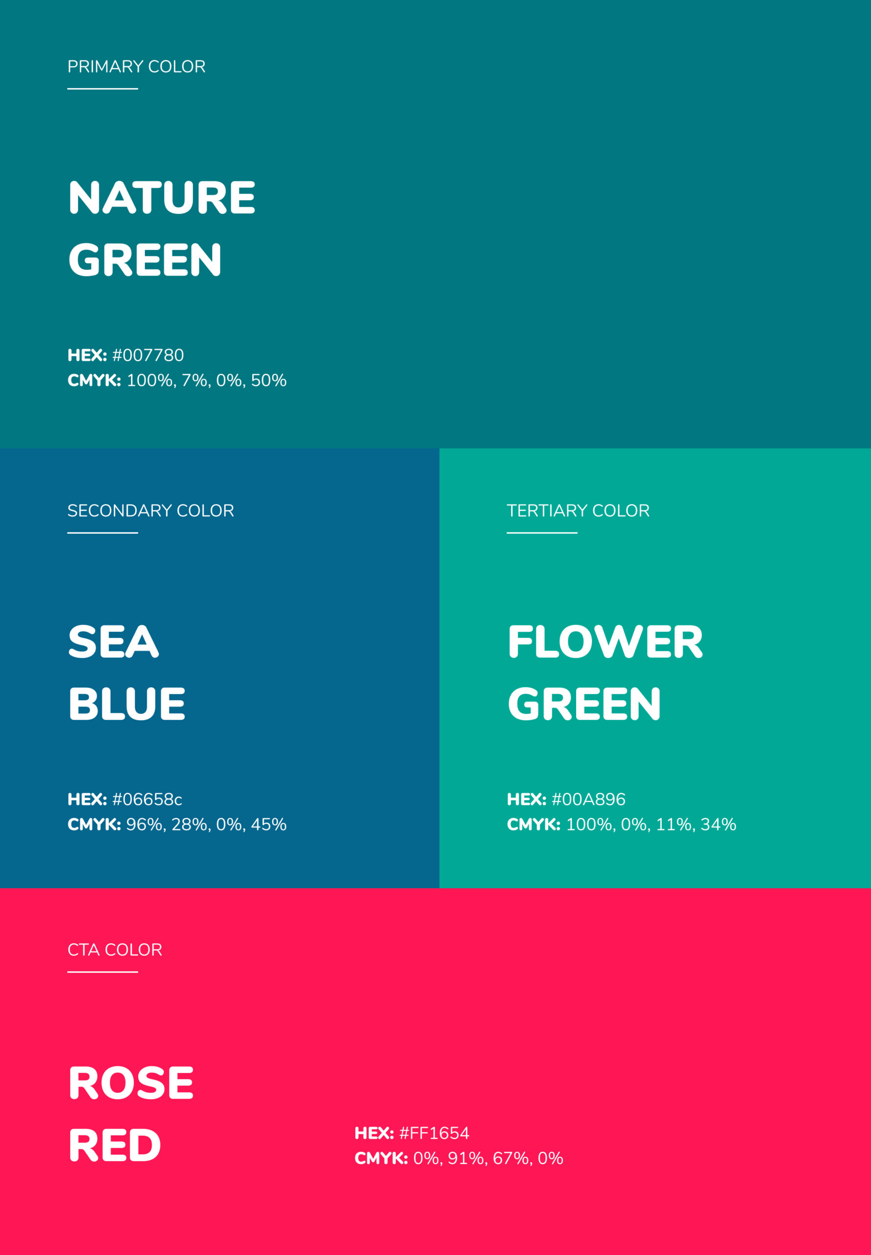
Design a new logotype , colors , typography & other branding materials to help visualize the brand goal/message through the brand identity.
Create UI/UX concepts with the latest design trends to improve the user experience of the product.
The Challenge
Campsaround is the first unified booking platform for glamping and alternative accommodations in Greece. All-in-one solution provides a number of features such as PMS, booking engine and content creation services, exclusively for the outdoor hospitality sector.
Over the last years, the travel market has evolved very fast. At the same time, travelers are looking for unique accommodations and authentic experiences during their vacation. In addition, only a few accommodations have a digital presence and the booking process is completed in traditional ways.
The problem Campsaround is trying to solve is the online accessibility of them, from travelers.
Process of branding & redesigning
a booking platform from scratch.
I started out by planning the design process of the re-branding approach, and started out with the most important, which was the logo of course! In my opinion a strong Logotype is the KEY for a “success” brand identity while you need it as a foundation to build other design materials that will represent the brand goal/message.
Selecting the logotype as a base helped me to jump into the typography , color palette & testing the logo on imagery variations. After all this is complete I was able to start designing the first UI/UX Concepts & Other branding materials such as business cards , flyers , banners and more.
Design process behind the re-branding:
1.Conducting Research
2.Clarifying Strategy
3.Designing ideas
4.Mockup Presentation
I did my research and gathered a lot of information that inspired my Moodboard. After the research I start creating the first logo concepts , I create many variations of the logotype but the one that stood out was an idea of a “Camp Tent” & “Search Icon” combined together as a symbol. The strategy/meaning behind this logo variation was to represent the brand goal/message instantly only with a glimpse.
Campsaround with simple words is a booking platform to search & book accommodations in nature without spending much time on traditional ways . At this point we decided to run a small “User Testing” and we asked people their thoughts on this logotype idea and the feedback we got was really positive. We confirmed also my thought of the message passing through the symbol after some users mention that .
With all this positive feedback we got from people, the CEO & COO of Campsaround chose it as the final logotype and after this decision I jumped into the remaining branding materials with real-life based images that will be mostly used in the future.
With the final branding design materials (logotype, colors, typography) I can officially begin the UI/UX concepts. Starting by creating a design guideline that will lead me across the UI components of the booking platform.
I designed concepts of the homepage, booking engine & some basic web pages of the booking platform. At this point, the state of the app wasn't able to transform the concept into an actual design on the live product. The limitations of technology used on the app already was the reason. Most of the UI concepts I designed were used as inspiration for the future re-designs of the product. I also gave several suggestions about the User Experience of the booking platform which they implemented with very positive results.